At the dawn of the smartphone, BlackBerry was the dominant force and had a stronghold of the marketshare. As years passed, new competitors began to emerge and over time their product offering took a pivot. While their brand is still recognized as a smartphone company by consumers, the reality is they actually license to third party production. Today, BlackBerry is a leader in enterprise software and security.
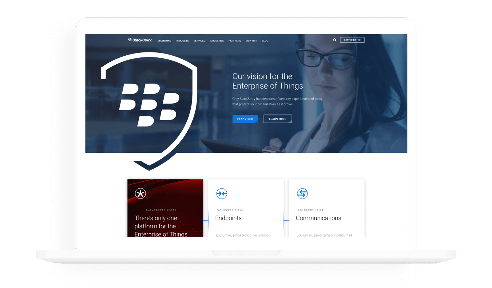
As the business shifted and the website took shape, it offered a lot of content but was difficult to navigate and understand. Visually it lacked consistency, and with endless brands and products represented, it was a real challenge for users to get an understanding of what was being offered, or find specific information they were searching.
The goal was to re-establish BlackBerry to a tier-1 brand, with bold positioning, a clear product offering, distinct visual expression and an enhanced user experience.
The Strategy
Alignment to strategic foundations
Develop standardized approach to page development
Optimized for mobile
Meet accessibility guidelines
Implementation across BlackBerry business units
Organize content so it’s easy for the user to understand and navigate
Visual queues for content types to help identify what type of page the user is on
Optimize content structure to educate user while directing them to actionable outcomes
Standardized layouts & web parts
Built in flexibility
The Strategy
User path
A focus on simplicity
A clear structure, moderate visual clues and easily recognizable targets
Focus user’s attention to relevant content
Make use of effective writing
Facilitate user engagement
Clear calls to action
The Strategy
Standardize how content is presented
Better organized content
Ensure content is accessible and easily digestible
Create consistency in what information is presented
Visual cohesiveness site wide
System
Imagery
Clean, light imagery with purpose
Product, lifestyle & contextual imagery
Natural lit, cool temperature and small depth of field